Alexa
Product Design | How we set a new course for the design of a companion app for Amazon's Echo product line.
Kindle Fire was first released in November 2011; along with it came FireOS, a custom version of Google's Android operating system. FireOS continued to evolve over the new few years to allow customers to enjoy books and social media, and streaming services.
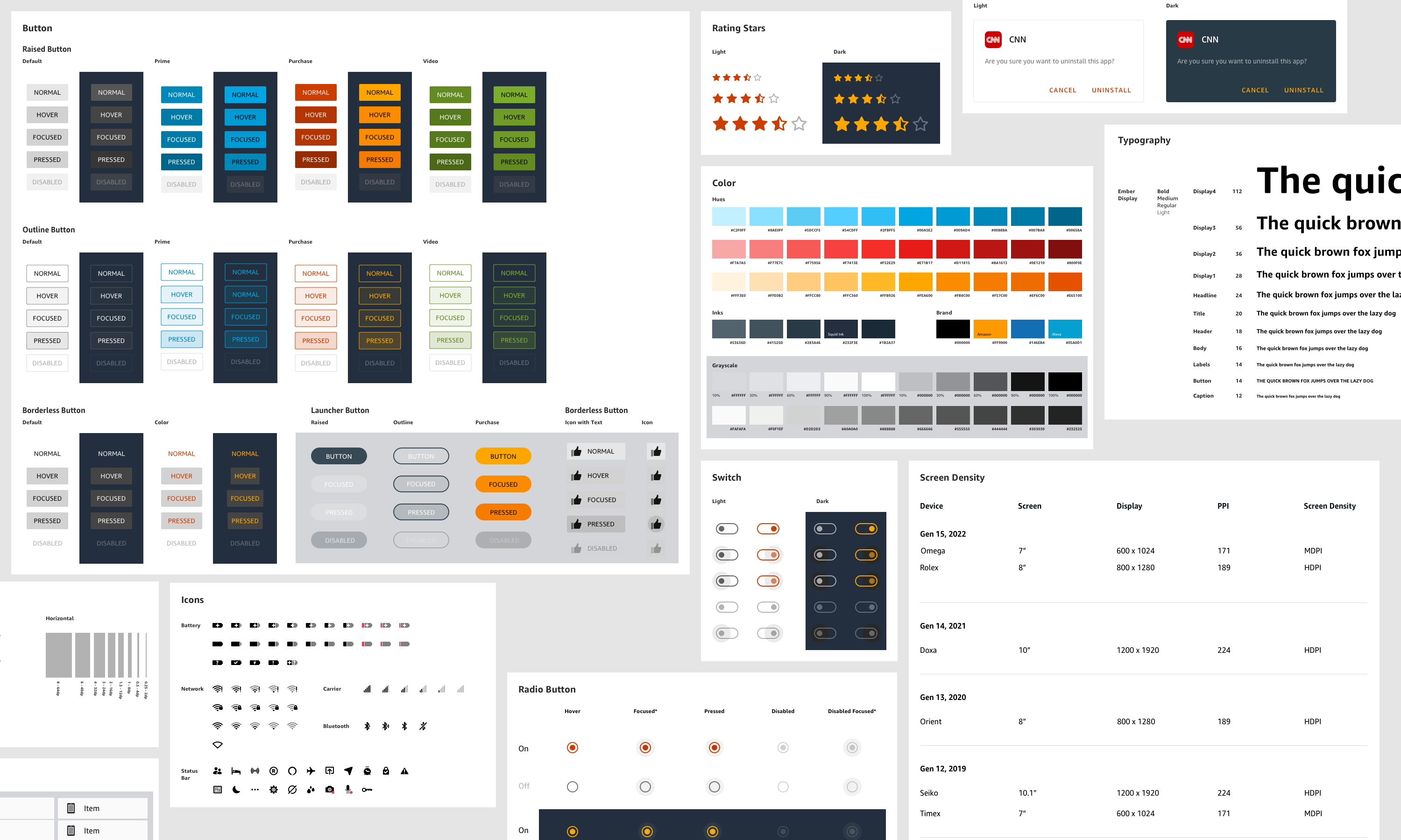
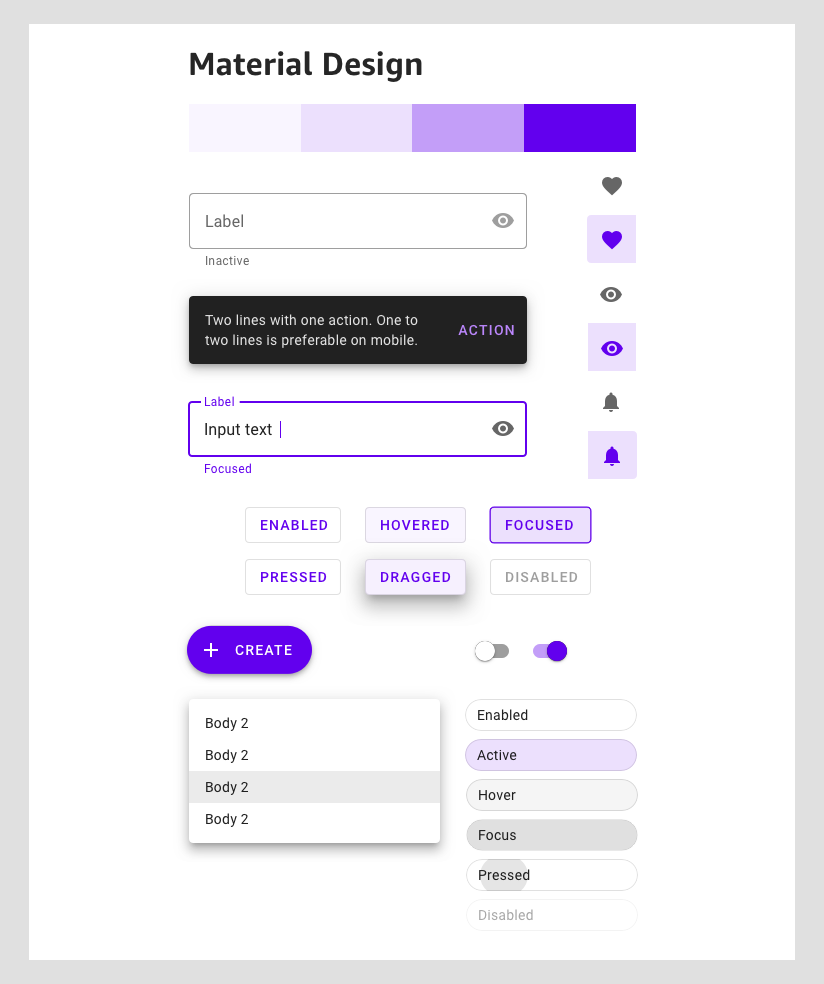
With the release of Android's Lollipop, we looked to leverage its redesigned user interface and updated design language known as Material Design, which was made to retain a paper-like feel to the interface.
Amazon began referring to the Android derivative as Fire OS with its third iteration of Fire tablets.
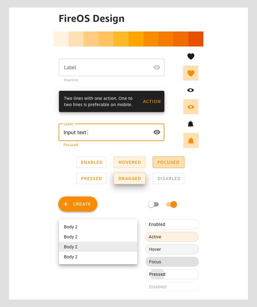
With Android Lollipop and Material Design readily available, we began exploring a fresh approach to a design system for FireOS, known as FLUID.
In previous releases of FireOS, Amazon was licensing fonts like Helvetica to be used within the software. With the latest FireOS 5, we were able to package our lates brand addition—Amazon Ember.
Adding Ember to our updated design system allowed greater control over the end-to-end look of the FireOS components and templates. It helped start the move towards a truly unified ecosystem for Amazon.
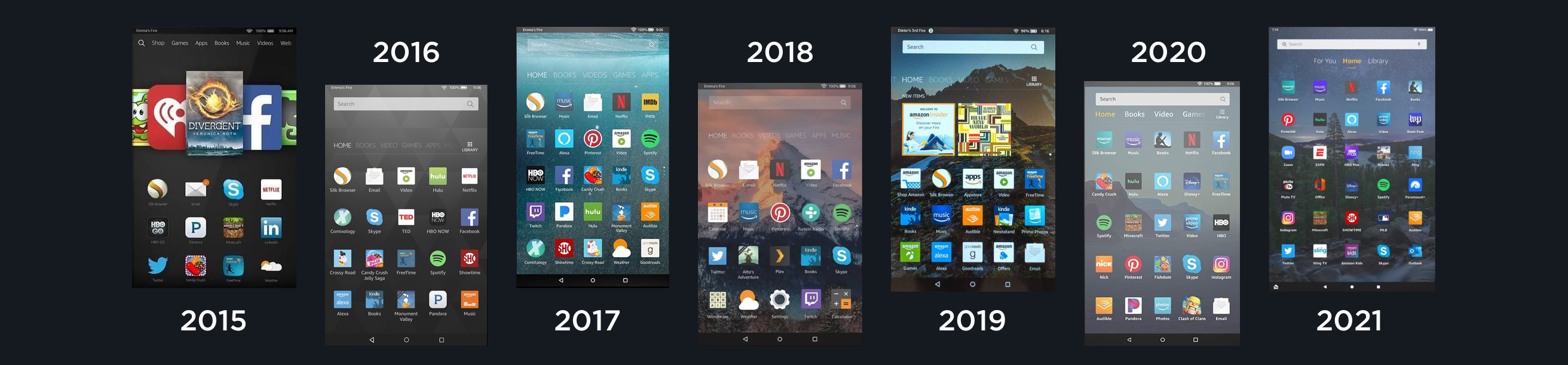
While FireOS 5 brought a new refresh to the Fire Tablet family, we continued to think about the next iteration. And with Android continuing to have its own treat-themed releases, those updates offered new ways for Amazon to advance FireOS.
After the success of FireOS 5, we looked to give our customers greater access to not only media, but Amazon's online e-commerce site. While it did add several new channels to the tablet, it came with pain points of ever-evolving template layouts to accommodate new content.
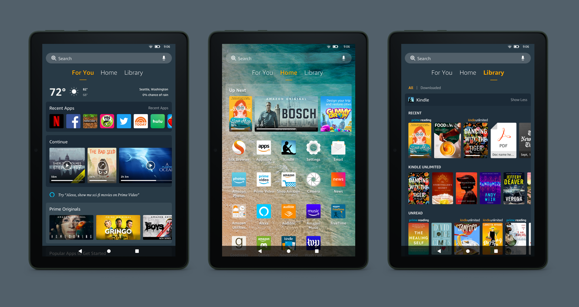
In 2020, after countless hours of research and user studies, we found that the channels previously sectioned out to help with shopping, media, and owned content wasn't allowing our customers to immerse themselves in the software. So, we consolidated the channels into three sections.
Over the years, the design language for FireOS has attempted to present itself as a standalone operating system. With the underlying software—Android—evolving over the years, the continued effort to customize components to make them more "Amazonian" has become increasingly difficult due to AOSP locking down areas of the OS. As an effort over the last year, we have explored the option to let Android and Google's Material Design play in our favor. By only updating the color palette, type ramp, and icons to align to the Amazon design language, the Android UI can provide the Amazon customer a smoother experience end-to-end.
Do amazing products excite you just as much as me? Reach out